
What Makes a Good Exhibition Stand?

A good exhibition stand is not the prettiest one in the hall. It is the one that gets noticed from 20 metres, is understood in three seconds, pulls the right people in, gives the team a place to have a proper conversation, and feeds a follow-up process that actually closes business. Design serves all of that — it is not the point on its own.
Here are ten principles that separate stands that work from stands that just look nice.
1. It starts from objectives, not aesthetics
Before a single visual, you need to know what the stand is for: lead volume, lead quality, meetings with named accounts, a product launch, press, recruitment. The design brief follows from that. A stand built to launch a product looks nothing like a stand built to hold 30 back-to-back client meetings. Get the planning right first.
2. It is visible from across the hall
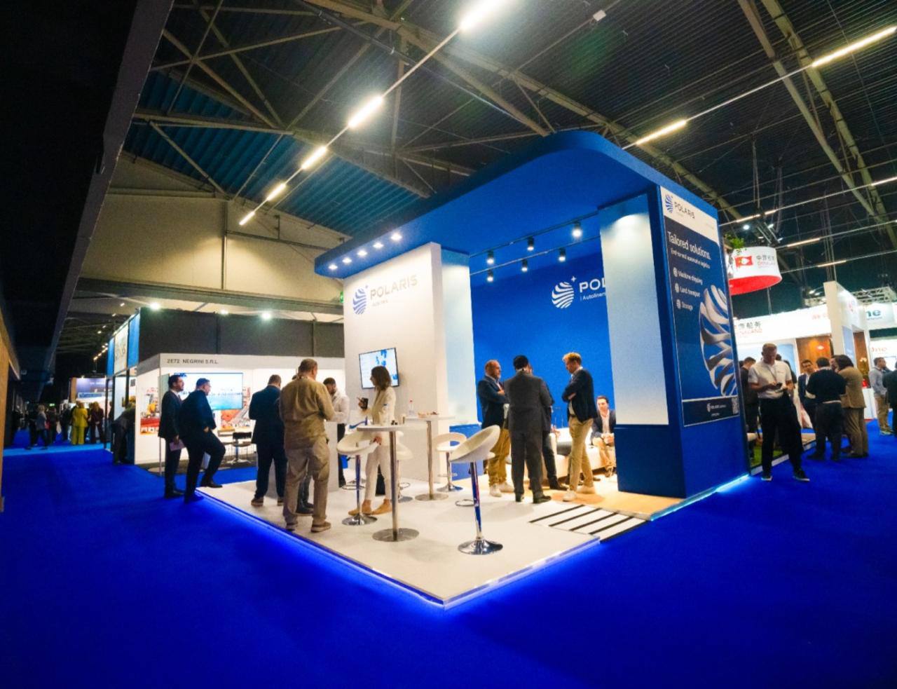
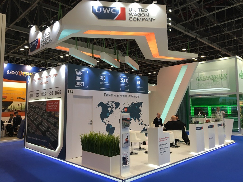
Visitors decide which stands to approach from a distance. Height and overhead branding do the heavy lifting — build to the maximum permitted height, use a raised header or a hanging banner on island plots, and keep the logo legible from every main aisle.
3. The message is instant
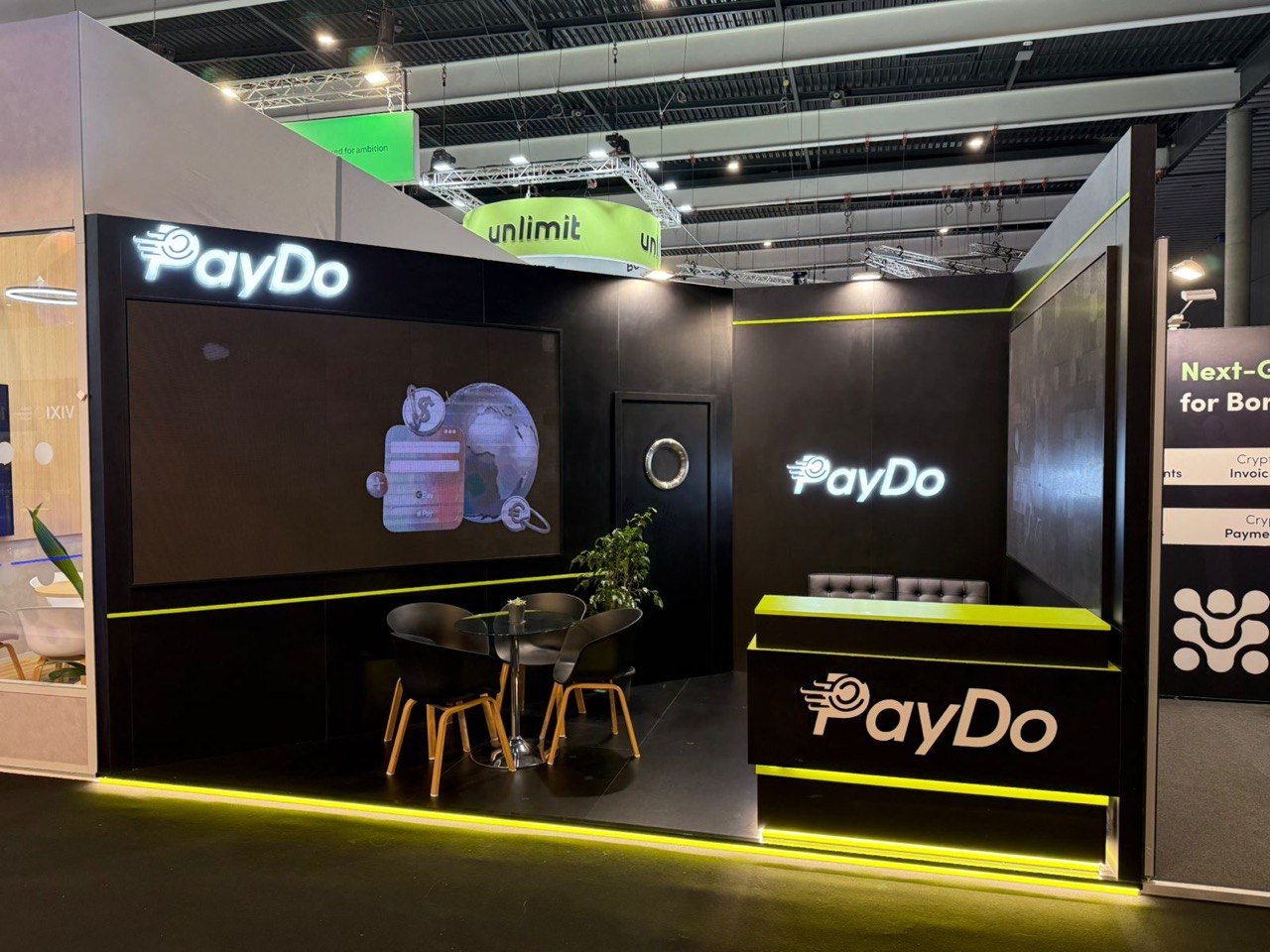
Three seconds to answer “who are you and why should I care”. One headline benefit, not a paragraph. Company name and category clear. Everything else — detail, proof, spec — belongs in the conversation or the collateral, not on the wall.

4. The entrance is open and obvious
Stands that wall themselves off get walked past. Keep sightlines into the stand, put an inviting focal point where the traffic is, and make it clear where a visitor should step on.
5. It has zones
A working stand separates: an open welcome area, a demo or product area, semi-private meeting space, and hidden storage for coats, bags and literature. Even a small stand needs this structure — see small stand ideas.
6. Lighting is designed, not left to the hall
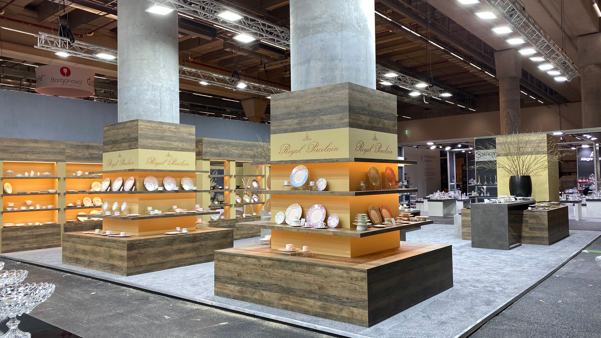
Hall lighting is flat and grey. Deliberate lighting — spots on products, backlit graphics, warm light in meeting areas — makes a stand look brighter, more expensive and more welcoming, and draws the eye to what matters.
7. Movement and interaction earn attention
The eye tracks movement in a static hall: a rotating header, a screen with motion content, a live demo, a simple interactive. One well-placed interactive element beats five gimmicks.

8. The materials and finish match the brand
Quality reads at a glance — clean joins, solid surfaces, crisp graphics, no wobble. A cheap finish undermines the brand more than a smaller stand would. This is largely about the builder’s process: in-house production, a full pre-build, buffer time in the schedule.
9. It is built for reuse (if you exhibit regularly)
If this is one of several shows a year, the stand should reconfigure to different spaces without a full rebuild. That is a design decision made at the concept stage — read modular vs custom.
10. It is backed by trained staff and fast follow-up
The best stand in the hall fails with staff who stand in a huddle looking at phones, or a lead list that sits untouched for a week — two of the most common exhibiting mistakes. Brief the team, script the qualifying questions, set targets, and contact every lead within 48 hours. Then measure the ROI.
Bringing It Together
A good stand is a system: clear objective, strong visibility, instant message, open flow, proper zones, designed lighting, one good interactive, quality finish, reuse built in, and a team-and-follow-up plan around it. Maverick designs and builds to all ten as a single turnkey service — see our work or send us your brief.
Frequently Asked Questions
What is the most important feature of an exhibition stand?
Visibility and an instant message. If visitors cannot see you from across the hall and understand what you do in three seconds, nothing else on the stand gets a chance to work.
How do you make a small exhibition stand stand out?
Build up not out, light it deliberately, keep one strong message, add a single interactive element, and keep the space open and tidy. See our small stand ideas guide.
How much text should be on an exhibition stand?
As little as possible on the structure — one headline benefit and your category. Detail belongs in the conversation and the collateral, not on the walls.
Does stand design affect trade show ROI?
Yes, indirectly. Better visibility and flow increase qualified footfall; better zoning and staff briefing increase conversion. But design only pays off with pre-show marketing and disciplined follow-up.
What makes an exhibition stand look expensive?
Height, designed lighting, clean joins and solid finishes, restrained messaging, and generous open space. Clutter and flat lighting make any stand look cheap.